
Big lesson from launch of our new mobile-friendly website
15/06/12 13:50 Filed in: Website
So, like all things, our ‘pretty cool’ website was due for an overhaul. We knew things needed to be streamlined - our offerings seemed to have ballooned over the past year and adding each, one after another, would eventually lead to a fair bit of clutter. Unless we rethought and regrouped the site significantly.
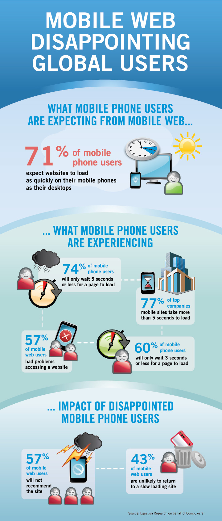
And ‘course discussion around the mobile web was right about the very first aspect on our minds. Stats abound - mantra being: mobile web is increasingly important. The succinct infographic above hit home.
Result: we did what is often the hardest thing to do. We simplified.
Going from a clear but multi-nested deep navigation menu, we streamlined so everything is now at one of only two levels: Root or Submenu. Period.
Here was our Guiding Light: when was the last time you surfed a website with a multi-nested menu from your mobile device - and actually genuinely enjoyed the experience?
We’re so pleased with our new site - we even resize the desktop browser to see how it changes automatically in a narrow window. It’s truly a thing of beauty! And yes, it’s the little details like this that make us really enjoy what we do. Otherwise it’d just be a job(!)
Cheers!